The Pros and Cons of Using Bootstrap for Web Development

Table of Contents
Discover the pros and cons of using Bootstrap for web development. Learn its benefits, drawbacks, and if it’s right for your next project!
- Introduction
- What is Bootstrap?
- What is Bootstrap in Web Development?
- What Does the Bootstrap Framework Include?
- Why Would You Use Bootstrap in Web Development?
- Is Bootstrap Framework Easy to Use?
- Pros of Using Bootstrap for Web Development
- Cons of Using Bootstrap for Web Development
- How Do You Use Bootstrap?
- The Future of Using Bootstrap for Front-End Development
- Conclusion
Introduction
Bootstrap has long been a cornerstone in front-end web development. Created by Twitter developers, it simplifies building responsive, mobile-first websites by providing ready-made components and tools. With its ease of use and flexibility, Bootstrap has become a favorite among developers worldwide. However, it is important to understand both its strengths and weaknesses to determine if it’s the right tool for your web development needs. This guide delves into the details to help you make an informed decision about the Pros and Cons of Using Bootstrap for Web Development.
What is Bootstrap?
Bootstrap is an open-source CSS framework designed to help developers create responsive and mobile-first websites efficiently. Launched in 2011, Bootstrap revolutionized front-end development by introducing a structured way to build layouts and design elements. Its pre-designed components and reusable code snippets allow developers to save time and ensure consistency across their projects.
What is Bootstrap in Web Development?
In the realm of web development, Bootstrap serves as a robust framework that accelerates the design and development process. It integrates HTML, CSS, and JavaScript-based templates, enabling developers to:
- Quickly build professional-looking websites.
- Ensure responsiveness across various devices.
- Simplify the implementation of dynamic components like modals and dropdowns.
By standardizing common elements and functionalities, Bootstrap streamlines workflows, allowing developers to focus on customization and innovation.
What Does the Bootstrap Framework Include?
Bootstrap is a widely popular front-end framework that helps developers create responsive and visually appealing web designs quickly. It provides a robust toolkit for developing with HTML, CSS, and JavaScript, ensuring consistent styling and functionality across different devices and browsers. Here’s a breakdown of what the Bootstrap framework includes:
Responsive Grid System
The core of Bootstrap’s responsive design capabilities lies in its grid system, which is based on a 12-column layout. It allows developers to:
- Create flexible and responsive layouts.
- Use predefined classes like
.container,.row, and.col-for structuring content. - Implement responsive breakpoints (
col-sm-,col-md-,col-lg-,col-xl-) for different screen sizes.
The grid system ensures that content is properly arranged on various devices, from small mobile screens to large desktops.
Pre-Designed Components
Bootstrap includes a wide range of reusable, pre-designed UI components, which save time and effort. Some key components are:
- Navigation: Navbar, breadcrumb, pagination.
- Forms: Inputs, checkboxes, radio buttons, and form validation styles.
- Buttons: Customizable buttons with different styles and sizes.
- Cards: Flexible and extensible content containers.
- Alerts: Pre-styled alerts for displaying messages.
- Modals: Pop-up dialogs for additional content or actions.
- Tables: Responsive and styled tables with support for striped rows, hover states, and more.
These components can be customized further to match the design requirements of a project.
Typography and Utility Classes
Bootstrap comes with a variety of typography utilities and utility classes for quick styling:
- Predefined styles for headings, paragraphs, blockquotes, lists, and inline text.
- Utility classes for margins, padding, text alignment, colors, and display properties.
- Customizable CSS variables for easy theme customization.
These utilities help developers maintain consistency in design without writing additional CSS.
JavaScript Plugins
Bootstrap includes a collection of JavaScript-based plugins powered by jQuery (in older versions) or vanilla JavaScript (starting with Bootstrap 5). These plugins enhance interactivity and functionality. Key plugins include:
- Modals: Pop-up windows for additional content or forms.
- Tooltips: Small pop-up hints when hovering over elements.
- Popovers: Enhanced tooltips with additional content.
- Dropdowns: Toggleable menus for navigation or actions.
- Carousel: Image sliders with support for transitions and captions.
- Collapse: Expandable and collapsible elements for better content management.
These features can be easily integrated with minimal coding.
Customizable Themes
Bootstrap offers the ability to customize its default theme using:
- SCSS (Sass): Allows developers to override variables and create a unique look for their project.
- Predefined Color Schemes: Built-in classes for background, text, and borders with different colors.
This flexibility enables developers to create designs that align with a brand’s identity while leveraging Bootstrap’s foundation.
Icons
Bootstrap includes a dedicated icon library called Bootstrap Icons, which provides scalable vector icons. These icons are customizable, lightweight, and ideal for modern web designs.
Browser Compatibility
Bootstrap ensures cross-browser compatibility by:
- Using CSS resets and normalization.
- Supporting modern browsers, including Chrome, Firefox, Safari, Edge, and more.
This ensures that websites built with Bootstrap render consistently across different environments.
Documentation and Support
Bootstrap provides comprehensive documentation that covers:
- Examples for all components, utilities, and layouts.
- Code snippets for quick implementation.
- Guides for customization and extending the framework.
Additionally, the active community and regular updates make it easier for developers to find solutions and stay current with web design trends.
Why Would You Use Bootstrap in Web Development?
Bootstrap, a popular open-source front-end framework, has become a go-to choice for web developers around the globe. Known for its simplicity, flexibility, and extensive features, Bootstrap provides tools to create responsive, mobile-first websites with minimal effort. Here’s why Bootstrap is a valuable asset in web development:
Ease of Use
Bootstrap simplifies web development with pre-written HTML, CSS, and JavaScript components. Even developers with minimal experience can quickly grasp its framework to create visually appealing designs. Its comprehensive documentation also makes it easy to understand and implement.
Responsive Design
Bootstrap’s mobile-first approach ensures that websites look great on all devices. Its responsive grid system allows developers to define layouts that automatically adjust to different screen sizes, reducing the need to create separate designs for desktop and mobile.
Time-Saving Prebuilt Components
Bootstrap comes with a variety of prebuilt UI components like navigation bars, buttons, forms, modals, and carousels. These elements can be customized and integrated quickly, significantly reducing development time.
Customizable Framework
With Bootstrap’s Sass variables and mixins, developers can tailor the framework to their specific needs. This flexibility enables the creation of unique designs while maintaining the consistency of Bootstrap’s structure.
Cross-Browser Compatibility
Bootstrap ensures consistency across different browsers and devices. Developers don’t have to spend extra time resolving browser-specific issues, as Bootstrap handles this behind the scenes.
Active Community and Extensive Resources
Bootstrap has a large, active community, which means extensive support, tutorials, and resources are readily available. Developers can find answers to questions, share tips, or download third-party templates to speed up their projects.
Integration with Other Tools
Bootstrap integrates seamlessly with various libraries, frameworks, and tools. Whether you’re working with Angular, React, or plain JavaScript, Bootstrap can enhance your web project without any hassle.
Built-in Icons
With Bootstrap’s introduction of its own icon library, developers can include scalable vector icons without relying on external resources. These icons are customizable and align well with the overall Bootstrap ecosystem.
Consistent Design Standards
Bootstrap’s predefined styles ensure that all components share a unified look and feel. This consistency helps maintain a professional aesthetic across different sections of a website.
Scalability for Complex Projects
Bootstrap isn’t just for small projects. Its robust nature makes it ideal for developing large-scale web applications. Features like modals, tooltips, and advanced form controls ensure that developers have all the tools needed for complex user interfaces.
Optimized Performance
Bootstrap is optimized for performance with minified files and CDN support. This ensures faster loading times, which is crucial for user experience and SEO.
Free and Open Source
As a free, open-source framework, Bootstrap eliminates licensing costs. Its permissive MIT license also allows developers to modify and use it in commercial projects without restrictions.
Is Bootstrap Framework Easy to Use?
Bootstrap is often praised for its simplicity and accessibility, making it an excellent choice for beginners. Its extensive documentation provides clear instructions and examples, guiding developers through every feature. Even those new to coding can create functional, attractive websites using Bootstrap’s grid system and components. Advanced customization, however, may require a deeper understanding of CSS and JavaScript.
Pros of Using Bootstrap for Web Development
Responsive Design: Bootstrap’s grid system and pre-designed components ensure your website adapts seamlessly to all screen sizes, whether it’s a mobile phone, tablet, or desktop.
- The 12-column responsive grid system allows for precise layout control, making your design flexible and user-friendly.
- Developers can achieve consistency across various devices without writing extensive media queries manually.
Pre-Styled Components: Offers a variety of customizable UI elements like buttons, cards, modals, navigation bars, and forms, which significantly save development time.
- These ready-made components are designed to look professional right out of the box.
- Developers can further tailor these components using custom styles or by leveraging Sass variables.
Cross-Browser Compatibility: Bootstrap eliminates common compatibility issues across different browsers.
- Its default settings ensure that websites function seamlessly on all modern browsers such as Chrome, Firefox, Safari, and Edge.
- This reduces the debugging and testing time required for cross-browser consistency.
Active Community: Bootstrap has a large, vibrant community and a dedicated development team that regularly updates the framework.
- Developers have access to extensive documentation, forums, and tutorials.
- The active user base contributes plugins, themes, and answers to common questions, making troubleshooting easier.
Customizable: Developers can modify Bootstrap’s default styles using its built-in Sass support, allowing for highly personalized designs.
- This means you can tweak everything from color schemes to component spacing without compromising the underlying functionality.
- Custom builds can be created by including only the features you need, reducing file size and enhancing performance.
Integration: Easily integrates with JavaScript frameworks and content management systems like WordPress, Angular, and React.
- This compatibility allows Bootstrap to be a part of larger, more dynamic web applications.
- Its pre-built components often work seamlessly with other libraries, enhancing development speed and reducing complexity.
Simplify Your Web Development with ByteCodeIT
If you’re looking for expert assistance in creating responsive and stunning websites, ByteCodeIT can help. Contact us via WhatsApp: +966549485900, Call: +447380127019, or Email: info@bytecodeit.com.
Cons of Using Bootstrap for Web Development
Uniformity: Without customization, many Bootstrap websites can look similar due to the widespread use of its default design elements.
- The reliance on standard components can result in designs that lack uniqueness, making websites appear generic.
- Developers need to invest time in customization to break away from the “Bootstrap look.”
File Size: The full Bootstrap library includes many features that might not be necessary for smaller projects, potentially bloating the code.
- Loading unused CSS and JavaScript can slow down the website, negatively impacting performance.
- Tailoring the Bootstrap build to include only essential features can mitigate this issue.
Learning Curve for Customization: While basic usage is straightforward, achieving a unique look often requires advanced knowledge of CSS and JavaScript.
- Customizing beyond the default styles may require proficiency in Sass or extensive CSS overrides.
- Developers might need to spend extra time mastering these skills to leverage Bootstrap fully.
Overhead: For simple websites, Bootstrap’s robust features may be overkill.
- Smaller projects might not require the extensive tools and components Bootstrap offers, leading to unnecessary complexity.
- Alternatives like lightweight CSS frameworks or custom CSS may be more appropriate for such cases.
Dependency: Over-reliance on Bootstrap can stifle creativity and make transitioning to other frameworks more challenging.
- Heavy dependency on Bootstrap classes can make the codebase less adaptable to other frameworks or custom solutions.
- Developers may find it difficult to move away from Bootstrap-specific practices when exploring new tools.
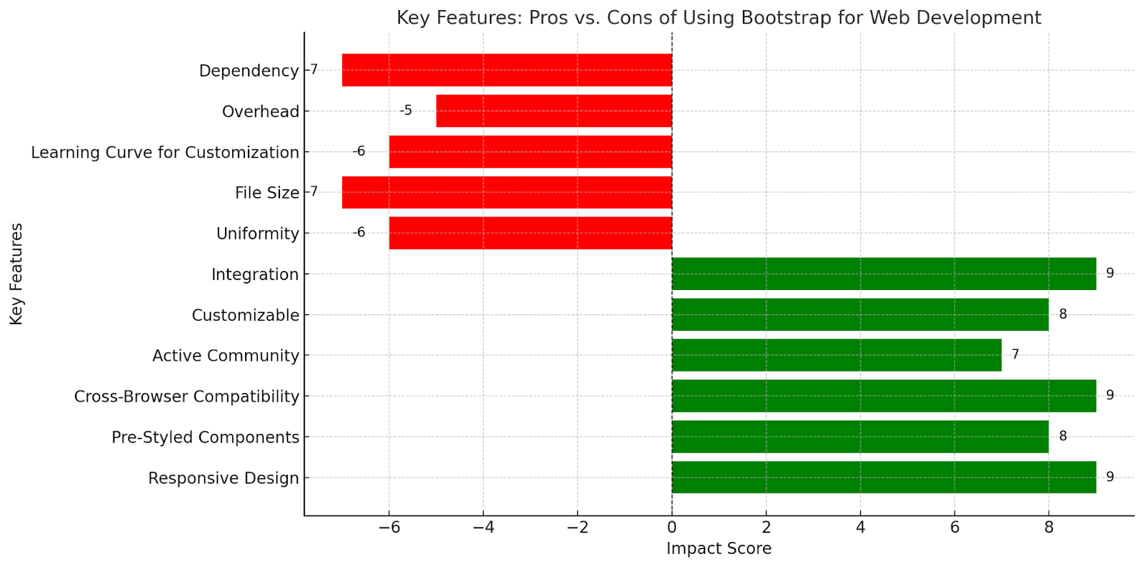
key Features Chart of Pros and Cons of Using Bootstrap for Web Development
Here’s a chart illustrating the key features of using Bootstrap for web development, separating the pros and cons based on their impact. Positive features (pros) are in green, while negative features (cons) are in red, with their respective impact scores.
How Do You Use Bootstrap?
Using Bootstrap is straightforward, making it accessible to developers of all skill levels. Here’s a step-by-step guide to get started:
Download or Link Bootstrap:
- You can download the Bootstrap files from the official website and include them in your project.
- Alternatively, use a Content Delivery Network (CDN) to link the CSS and JavaScript files directly in your HTML document.
Set Up the HTML File:
- Create a basic HTML file and include the linked Bootstrap CSS and JavaScript files in the
<head>and<body>sections respectively.
<!DOCTYPE html>
<html lang="en">
<head>
    <meta charset="UTF-8">
    <meta name="viewport" content="width=device-width, initial-scale=1.0">
    <link href="https://cdn.jsdelivr.net/npm/bootstrap@5.3.0/dist/css/bootstrap.min.css" rel="stylesheet">
</head>
<body>
    <script src="https://cdn.jsdelivr.net/npm/bootstrap@5.3.0/dist/js/bootstrap.bundle.min.js"></script>
</body>
</html>
Build Your Layout Using the Grid System:
- Use the responsive grid system to create rows and columns for your layout.
- Example:
<div class="container">
    <div class="row">
        <div class="col-md-6">Column 1</div>
        <div class="col-md-6">Column 2</div>
    </div>
</div>
Add Pre-Styled Components:
- Incorporate pre-designed elements like buttons, navbars, forms, and modals by copying the relevant code snippets from Bootstrap’s documentation.Example of a Button:
<button class="btn btn-primary">Click Me</button>Customize with Sass or CSS:
- Use Bootstrap’s built-in Sass files to customize variables like colors, fonts, and spacings.
- Alternatively, override Bootstrap’s styles by adding your custom CSS file.
Test Responsiveness:
- Check your design on various devices to ensure it adapts well to different screen sizes.
Enhance with JavaScript Plugins:
- Add dynamic behavior to your website using Bootstrap’s JavaScript plugins for modals, carousels, and dropdowns.
By following these steps, you can create responsive, professional websites efficiently, while leveraging the power of Bootstrap’s framework.
The Future of Using Bootstrap for Front-End Development
As web development evolves, Bootstrap continues to adapt to meet modern demands. Key trends influencing its future include:
- Improved Performance: Ongoing updates focus on reducing file sizes and enhancing load times.
- Greater Customization: Tools like Sass variables enable developers to achieve tailored designs more efficiently.
- Accessibility: Future versions aim to enhance support for assistive technologies, ensuring inclusivity.
- Competition: Frameworks like Tailwind CSS offer alternative approaches, encouraging Bootstrap to innovate further.
While the rise of new frameworks introduces fresh competition, Bootstrap’s legacy, vast community, and comprehensive features ensure it remains a staple in front-end development.
Conclusion
Bootstrap remains a powerful and versatile tool for front-end web development. Its balance of simplicity and functionality makes it a popular choice for projects ranging from small business websites to enterprise-level applications. Understanding its advantages and limitations helps developers harness its potential while addressing its shortcomings.
Start Your Bootstrap Project with ByteCodeIT
Let ByteCodeIT’s experts help you harness the power of Bootstrap for your next web development project. Reach out via WhatsApp: +966549485900, Call: +447380127019, Email: info@bytecodeit.com, or visit our website: www.bytecodeit.com.
Here’s a strategic internal and external linking plan for your blog post “Pros and Cons of Using Bootstrap for Web Development” to enhance its SEO value.
Internal Resource and Services
- If you’re looking for more flexibility, check out our detailed guide on Bootstrap alternatives for web design.
- Learn more about the importance of responsive design and how Bootstrap supports it effectively.
- For a broader perspective, explore our web development frameworks comparison.
- Discover how Bootstrap stacks up against other CSS and front-end tools.
- Using Bootstrap? Here’s how it can contribute to improving website load speed.
External Resource
- For a deep dive into its features, visit the official Bootstrap documentation.
- Ensure your web design adheres to W3C’s web design guidelines.
- Test how responsive your Bootstrap site is using Google’s Mobile-Friendly Test.
- Join the conversation on best practices in this Stack Overflow discussion on Bootstrap.
- Compare Bootstrap’s grid system to modern approaches like Flexbox and Grid.


